

DESIGN ELEVATIONS
Expert design advice, visionary design wisdom, pro-tips and more!

Volumes


The Latest DESIGN ELEVATIONS Article

Home Styling & Staging Tips to Elevate Your Home
1) Art Height, Proportion & Placement Height
-
The center of the art work should be between 57 and 60 inches from the floor
-
When hanging art above furniture, like a sofa or console table, leave 6 to 8 inches from the top of the furniture to the base of the frame
-
In designated sitting rooms art can be hung slightly lower height, the key with hanging art is that it should remain eye level whether sitting or standing


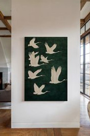
Proportion & Placement
-
Use the two-thirds rule, meaning the art itself whether singular piece or a series should be two-thirds the width of the furniture below it
-
When hanging multiple pieces together, there should be 3 to 4 inches between the edge of each piece
-
For gallery walls, first start with your centerpiece of art then add additional pieces vertically and horizontally. Depending on the desired look for the gallery wall they will vary in size. Use consistent spacing and the the two-thirds rule for the most visually appealing result.


2) Furniture Placement
-
The golden ratio for any living space is 60/40, where 60% of the space is utilized for furniture and the remaining 40% is empty. This creates an ease to the space allowing for proper traffic flow and movement.


Applying the golden ratio to a living room:
-
Start with the focal point: Identify the room’s focal point, such as a fireplace or a large window, arrange largest furniture around point of interest.
-
Size your sofa: Choose a sofa that is roughly two-thirds the length of the wall it will occupy. This same rule can be applied for floating arrangements too, ensure the largest piece of furniture that it will parallel is two-thirds. **If using a current sofa follow previous sizing parameters for ratio scale.
-
Size your coffee table: Aim for a coffee table that is about two-thirds the length of your sofa. The height of the table should be level, or 1-2 inches shorter than the seating height. **For coffee table’s in a conversation grouping, the table should also be two-thirds the flanking furniture on each side.
-
Arrange accent chair(s): Position accent chairs to create a conversational grouping with the sofa, ensuring they create a balance to the size of the sofa and not too far from the coffee table.
-
Prioritize traffic flow: Leave at least 16-18 inches of space between the sofa and the coffee table to allow for easy traffic flow. Ensure all paths are clear on anchoring pieces (coffee table) for visitors to move freely without bumping in adjacent furniture.


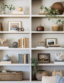
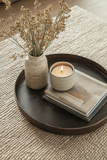
3) Styling of Shelves and Top Surfaces
Key Principles for Shelf & Surface Styling:
-
Group in Odd Numbers: Items arranged in groups of three, five, or seven are generally more pleasing to the eye than even-numbered groupings. This creates an asymmetric but balanced look.
-
Create Consistency: To create consistency on shelving using a collection of items, place items using a cohesive color, print, texture or even repetition of similar items (e.g., books, printed/patterned glassware, plants). Place these items using the triangle technique, first establish a starting point for those items then repeat at the peak and again at a “mid-point”. This will draw the from each point creating an intensional and polished result.
-
Vary Height and Scale: Avoid placing items of the same size next to or above each other. Combine a mix of tall, medium and small objects (e.g., a tall vase next to a stack or horizontal books with a small object on top) to create a dynamic display and lead the eye around the area.
-
Embrace Negative Space: Do not feel the need to fill every single inch of space. Intentional empty space, or “breathing room,” is crucial for a curated and uncluttered look, allowing each item to stand out.
-
Create Layers and Depth: Place larger items like framed art or a large vase at the back of the shelf/surface and layer smaller items in front. This adds dimension and prevents the display from looking one-dimensional.
-
Maintain a Cohesive Color Palette: Stick a consistent color scheme (e.g., a base neutral palette with one or two accent colors) to tie all the items together, even if the objects themselves are varied.
-
Incorporate a Mix of Textures and Materials: Combine different textures (e.g., smooth glass with rough/distressed wood or woven baskets) to add richness and depth to the display.
-
Add Personal Touches and Greenery: Infuse personality with meaningful items like family photos or travel souvenirs. Live or faux plants add and organic touch and bring life to the display.


NOTE: If you are staging your home for sale proceed with the Key Principles for Shelf & Surface Styling but exclude any and all personal items like family photos. This will allow prospective buyers to imagine themselves in the home and the life style presented. For wall art collections like a family gallery wall, either remove the gallery wall all together, or replace the family photos with a mix of art consistent with the aesthetic of the home liuke landscape images for a well curated look. When staging your home for sale less is more with use of personal items. Remember buyers want to easily imagine their new life in the home, not like they are visiting a showcase of your life.
By following the outlined guidelines, you can create a balanced, visually appealing, and intentional look to enjoy for years or showcase your home best for a successful sale of your home. Home’s that are staged with the new potential buyer in mind on average sell 70-88% faster with less time on the market!


The DESIGN ELEVATIONS Library


Our Favorite Design Trends for 2026
Modern Tuscan
This isn’t your grandmother's Tuscan with dark cherry woods, heavy iron scroll work and travertine everything but instead a cousin to warn minimalism.
Modern tuscan is not a theme but instead a tone, like an Italian Country side not the Cheesecake Factory.
It has warm grounded interiors with a quiet luxury to each space. Using warm neutrals in sand, clay and earthy greens. It is space with contrast and balance. An old soul with modern simplicity, think lime wash walls terracotta floors and modern rounded edge furnishings.
Contrast is key with this look, old vs new, rough finishes paired with smooth, and sharp corners vs soft edges.
Key elements to include are dark brown wood stains, honed stones, linen and heirloom collected furniture pieces and accessories.


Core Characteristics of Modern Tuscan Design
-
Lighter Color Palettes: Heavy ochres and deep burgundies have been replaced by soft creams, warm whites, and muted earth tones like sand and clay.
-
Refined Natural Materials: Natural stone (like honed travertine or limestone) and wood are still central, but they are used in a more natural, less "clunky" way.
-
Minimalist Furniture: Oversized, ornate leather furniture is swapped for pieces with simpler silhouettes and contemporary forms, often upholstered in natural fabrics like linen or wool.
-
Subtle Wall Textures: Dark faux-glazes and heavy plaster are replaced by subtle limewash or smooth plaster that adds depth without overwhelming the space.
-
Open, Airy Layouts: Modern Tuscan homes prioritize natural light and seamless indoor-outdoor flow, often featuring large, unadorned windows and arched doorways.


Key Design Elements
-
Wood Finishes: Preference for light, natural woods like European oak, walnut, or reclaimed timber with matte or clear finishes rather than dark, glossy stains.
-
Metalwork: Minimalist use of metals, such as matte black steel or subtle bronze for fixtures and railings, replacing ornate, scrolling wrought iron.
-
Architectural Anchors: Features like a single monolithic stone fireplace or exposed natural wood ceiling beams serve as architectural "hero" pieces.
-
Handcrafted Accents: A shift toward unique, artisanal items like hand-painted zellige tiles, hand-thrown ceramics, and vintage artwork.


Our next favorite design look for 2026
Grandpa Chic
This a transitional look to the core. Granda Chic is an interior design style that emphasizes a "collected over time" look, blending nostalgic heritage elements with modern comforts. It is often described as a more masculine and moody counterpart to the “Grandmillenial” trend.
It’s moody but happy, traditional but casual. These spaces each tell a story about the person living there like their history, accomplishments, and hobbies.


Core Characteristics of Grandpa Chic
-
Layered & Non-Minimalist: It focuses on abundance rather than simplicity, featuring layers of textiles, patterns, and accessories.
-
Aged Patina: The style prioritizes pieces that show their history, such as worn leather, tarnished metals, and weathered wood.
-
Masculine & Moody Palette: Dominant colors include forest green, navy blue, burgundy, chocolate brown, and deep rust.
-
Classic Patterns: Plaid, tartan, herringbone, and houndstooth are signature prints used for upholstery, pillows, and rugs.
-
Curated Authenticity: Instead of matching sets, rooms feature unique finds from different eras, such as a vintage armoire paired with a modern sofa.


Key Design Elements
-
Furniture: Oversized, comfortable seating like leather club chairs, chesterfield sofas, and solid dark wood tables or bookcases.
-
Textiles: Heavy, high-quality fabrics like wool, velvet, corduroy, and tweed.
-
Lighting: Warm, ambient lighting using brass lamps, vintage chandeliers, or Edison bulbs.
-
Accessories:
-
Stacked vintage books and antique clocks.
-
Traditional oil paintings (landscapes or portraits) and old family photos in mismatched frames.
-
Tchotchkes like porcelain figurines, brass candlesticks, or unique thrifted finds.
-


Lighting Architecture:
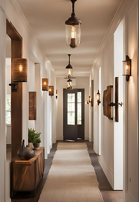
our guide to selecting the right lighting for each room.
Warm White Light (2000K-3000K)
Golden, soft light that creates a cozy, relaxing, and inviting atmosphere.

Living Rooms & Dining Rooms:
2700K-3000K to create a warm, cozy, and inviting environment for socializing.

Bedrooms:
2700K-3000K for a relaxing atmosphere conducive to sleep.
Living Rooms & Dining Rooms:
2700K-3000K to create a warm, cozy, and inviting environment for socializing.
Neutral White Light (3500K-4500K)
A balance between warm and cool light, providing a more natural and comfortable feel.

Bathrooms:
3000K-4000K for good visibility during grooming and a fresh feel.

Kitchens:
3500K- 5000K, for bright, functional light that enhances visibility and accurate color reproduction during food prep and cooking.
Cool White Light (5000K-6500K)
Bright, ultra-white light that mimics natural daylight, promoting energy and focus.


Offices & Workspaces:
4000K-5000K to stimulate the mind, increase efficiency, and promote concentration.

More Lighting Tips to Consider…
-
Mood: Consider the primary activity and desired mood for the space. Cooler temperatures are better for task-oriented areas, while warmer temperatures are ideal for relaxation.
-
Multifunctional Spaces: Consider dimmable lights for multifunctional rooms to adjust the atmosphere for different activities.
-
Color Rendering Index (CRI): A higher CRI (80+) ensures colors appear more natural and true to life, which is especially important in kitchens and bathrooms.
-
Bulb Type: We always recommend using incandescent light bulbs over LED. Incandescent has been proven to provide a more natural & healthy light spectrum without the hidden & harmful flicker rate of LEDs.
Proportion, Placement & Purpose


Whether you are a minimalist, a maximalist or, like us, somewhere in between we always pay attention to the 3 P's.
In designing any space wether it is for gathering and sharing a meal, lounging or, meditating we find proportion, placement and purpose are the keys to success for a magical melody of beauty, form and, function.
Proportion, for us, is a symphony of matter and material to ground and anchor a room balanced with enough open space and emptiness. Wether it’s repeating a chandelier, lighting seven candle sticks on the dining table or leaving open spaces for the floating shelves to breathe and flow. It's always a good idea to take a step back and look at the entire room and ask yourself, "does it look cluttered? does it look empty? is there harmony and flow in the space?" Proportion teaches us to take an honest look and inventory our surroundings without judgement.
Placement is all about the intention behind where items land throughout your sacred spaces. We ask ourselves, "what is this space providing for us?" Are we trying to evoke beauty, mystery, story telling, relaxation, healing, or all of the above. With a clear vision, your personal items can guide you to where they belong and where they want to be, keeping in mind, they may not belong in the space at all. It is said there are rules, techniques and proper etiquette and grammar for any design language and we would agree and, the practice of placement is truly about allowing your intuition to take the lead and allowing your spaces to communicate with you.
And lastly for us, purpose is the most vital to any successful design. What is the purpose for this space and do these things support this purpose? For example our dining room is a space to gather, eat and share stories. So we decided to put in a library wall filled with our life's stories, memories and ancient wisdom we've learned along the way. Our family room is our healing sacred space to relax and mediate. In this space clarity, health and beauty are paramount. So we have and abundance of healing plants for fresh oxygen, crystals for their healing frequencies, as well as symbols and items that represent or serve the purpose of relaxing and meditating such as the snake which represents continuous life-long growth and a profound heart connection with the earth or the mirrors representing the phases of the moon. Purpose is all about designing with intention and being clear about what IS the purpose of each space and the purpose every item has in each space.
With the 3 P's in mind you can transform any room into a sacred sanctuary of self-expression, a temple of memories and a healing cocoon where we can inspire our true divine essence, find inner peace and feel nurtured.
The Healing Frequencies of Color

As we meditate on the major themes for the new year, healing emerges at the top of the list and, one primary healing tool that we can often over look is our home environment. In fact, we consider our home to be the most sacred, protective, and nourishing healing sanctuary spaces that we have access to and regard it as medicine for our physiology & nervous system, our mental & emotional health as well as our spiritual & energetic vibrancy. Therefore, we lovingly maintain an exceptionally clean and organized home, which is not always easy when we share our home with four animals plus the two of us. However, instead of drifting out of space and time on our phones, as we can sometimes find ourselves doing, we carefully curate our home and intentionally make time to sit back and consciously enjoy it and, offer it deep appreciation for all the nourishing support, comfort, beauty and inspiration it provides for us and our family. This often looks like making a medicinal herbal tea or, my personal favorite, healing ceremonial cocoa (organic cocoa, activated charcoal, Ceylon cinnamon, ginger, nutmeg, allspice, clove and a dash of black pepper and sometimes a splash local unfiltered honey, date sugar or syrup) and allowing our home to comfort us as we relax into a conscious gaze around our home with profound gratitude and love, talking to our home, visiting with the cherished memories immortalized around our home, blessing our home every single night, visiting with our ancestors at our ancestor table, lighting some candles or incense or, gifting our home with some fresh cut greenery from the garden. Our home constantly reminds us to live a more intentional, grateful and healing life and one of the most potent medicinal properties our home offers us is the healing power of color!


Color is a frequency of light reflection that bears the capacity to affect our mental, emotional and even physical state of being. One of the main colors we chose for our home is teal. Teal is a mixture of greens and blues and offers the healing properties of both colors.
GREEN is the most predominant color found all over the world and, that is because it is one of the most healing colors that balances our energies, reduces inflammation and high blood pressure, soothes the autonomic nervous system and, promotes inner-peace and revitalization of our entire energetic system. It is the color associated with the heart chakra and increases our capacity for love and compassion which are two of the highest frequency emotions we can experience. Green hues leaning towards the blue spectrum, i.e. teal, can be the most powerful healing vibrations of all the colors.
BLUE is another predominant color of our world as it is the color of our sky and oceans. Blue is known for its calming and relaxing qualities. It is used to quiet our energetic nervous system as well as strengthen and deepen our breathing. Blue can also help activate and awaken our divine intuition, creativity and inspiration. To harness all of blue's healing potential it should be balanced with warmer colors.
YELLOW/GOLD is a stimulating color that exudes joy and vibrancy which is great for reawakening your enthusiasm for life. It can also be used to increase confidence and optimism. Yellow is connected with the solar plexus chakra and is known to promote gastrointestinal health, a vibrant immune systems and detoxifying our physical and mental bodies.
ORANGE is a socially stimulating color that promotes the exchange of joy and wisdom. It is great for our emotional and muscular systems but too much orange in our environment can have an adverse affect on our nervous system so it should be balanced with shades of blues, greens or purples.
RED is a warming and energizing color that activates our physical life force energy. Red, connected to our root chakra, strengthens our energy levels including our will power, passion and, courage but too much red can be over-stimulating and aggravate our nervous system therefore red needs to be balanced with grounding colors like blacks and browns.
VIOLET/PURPLE is a high-vibrational color that is deeply healing, soothing and purifying for the physical and spiritual dimensions of our being. Violet stimulates our connection with the divine including creative inspiration, expanding our awareness and promoting dream activity. Reddish purple is beneficial for balancing the energetic polarities of our body while bluish purple can help reduce inflammation and disease.
PINK is a color for awakening compassion, love and purity. It soothes emotions of anger and neglect and promotes the ability to see beyond with greater clarity and discover overriding truths. Pink also stimulates a happy and robust immune system.
BROWN is another deeply healing and grounding color that is very effective for our emotional and mental health. Brown awakens our common sense, brings us back down to earth and, promotes healthy discernment and clear boundaries.
WHITE contains and reflects the entire light spectrum and is the color of purification and creativity. White is very stabilizing for our energetic nervous system and amplifies the affects off any color it is paired with.
BLACK also contains the entire light spectrum but in a different capacity than white. Black is an absorbing color therefore it can be great for protection, grounding, detoxifying and calming. Black should be used sparingly so that is doesn't consume or overpower the energy of your space and paradoxically, every space should contain a little touch of black. It works best in conjunction with other colors especially white which can balance the energetic polarities of our being.
As we prepare to begin a new calendar year we hope to provide you with a new perspective and a deeper insight to your surrounds and the abundance of healing opportunities at our creative fingertips!

Tips for Creating a
Holiday Decor Theme
1. Analyze Your Home's Existing Style
The first step is to identify the core design language of your home or space. Is your home a cozy rustic farmhouse, a sleek modern condo, a traditional colonial, or perhaps an eclectic bohemian mix?
-
Rustic/Farmhouse: Focus on natural elements like wood, burlap, evergreen boughs, and simple, cozy mood lighting and candles.
-
Modern/Minimalist: Opt for a refined, clean and edited look with metallic accents, geometric shapes, and a minimal color palette.
-
Traditional: Embrace classic reds and greens, rich velvets, abundant garland, and formal displays.
-
Bohemian/Eclectic: Feel free to mix vintage ornaments, colorful textiles, and unique, global-inspired decorations.
Understanding your style prevents a design clash and ensures your holiday decorations feel like they belong.


Above: cozy rustic farmhouse holiday decor
Below: modern & minimalist holiday decor


Above: traditional holiday decor
Below: bohemian & eclectic holiday decor


2. Borrow from Your Home's Color Palette
The easiest way to integrate holiday decor is to extend your current color scheme.
-
Neutral Interiors: Homes with a palette of gray, beige, and white are perfect canvases. Introduce elegant metallics (silver, gold, or champagne), icy blues, or deep forest greens for a sophisticated, subtle pop of color.
-
Bold Interiors: If your home features bright colors, pull a complementary color from an existing piece of art or rug. Red accents can work beautifully in a room with deep blue walls, while turquoise or lime green accents can brighten a neutral space.
Sticking to 2-3 main colors for your holiday theme will create a cohesive look that flows seamlessly from room to room.


3. Choose a Unifying Theme
A theme acts as a guiding principle for all your decorating choices, from the tree to the mantelpiece.
-
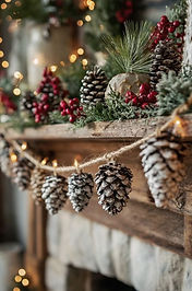
Nature-Inspired: This universal theme works with almost any home style. Use pinecones, cranberries, fresh greenery, and dried citrus slices.
-
Vintage Charm: Collect antique ornaments, mercury glass, and retro-inspired decor for a nostalgic feel.
-
Winter Wonderland: Focus on whites, silvers, faux fur, and twinkling lights for a frosty, magical atmosphere.


Themes from right to left: Nature, Vintage (glam), Winter Wonderland, Vintage (moody), Designer
4. Focus on Cohesion
Ensure that the transition from one room to the next feels smooth. While themes might vary slightly (perhaps a formal dining room theme versus a cozy den theme), they should share a common element—like a specific metal finish or a shade of green—that ties the whole house together.
By aligning your holiday decor with your home's unique character, you create a festive environment that is effortlessly stylish, welcoming, and authentically "you."
5. Edit Your Space
Take a moment and review the space you are adding decor. Is this area getting too busy? Is there a disconnect with current decor? If there is, remove select “everyday” decor to simplify the space. Be selective and choose pieces that fit your established theme and color palette. For example, replace standard throw pillows with festive ones, or incorporate ornaments into everyday centerpieces and bookshelf displays. This layering technique helps blend the seasonal changes with your permanent home decor.


Themes from right to left: Classic, Luxe, Glam, Organic, Traditional

Tips for Creating a Festive Holiday Tablescape
Set the foundation
-
Choose a festive holiday color palette:
For Thanksgiving select warm seasonal colors like earthy browns, golden yellows, crimson reds, burnt oranges, and maybe even with pops of deep violet and merlot--think of the symphony of colors displayed by the autumn leaves this time of year.
Our pro tip is to keep the color palette classic and you can add a pops of nuance if you want to be creative. -
Add a base: Use a tablecloth or a table runner in a coordinating color or a neutral shade to ground the design.
-
Consider layers: Add a charger plate or a place mat in a fall color or a contrasting texture to elevate the place settings.


Above: Thanksgiving tablescape design process-- mood board to finished product.
Below: Timeless holiday tablescape ideas


Create a centerpiece
-
Go natural: Use a mix of Mother Nature's seasonal bounty like pumpkins, pinecones, decorative edibles like seasonal fruits and vegetable (apples, pears, pomegranates, artichokes, gourds, etc.), crystals, beeswax candles and foraged branches.
-
Try a DIY arrangement: Create a floral centerpiece in a pumpkin or use a classic cornucopia filled with fruits and flowers. You can embellish with seasonal decor like deer, turkeys and Christmas ornaments, etc.
-
Keep it simple: If a large centerpiece isn't your style, use a bowl of assorted seasonal fruits, decorative spheres, or candles on a runner.


Aesthetic ideas from right to left: Traditional, Eclectic, Classic, Organic, Rustic
Add festive details
-
Elevate place settings: Use cloth napkins, creative napkin rings, and custom place cards to make each guest feel special.
-
Mix and match: Pair simple white dinnerware with decorative dinnerware and elements like metallic pumpkins or seasonal accents-- contrast is key.
-
Engage all 5 senses: Incorporate varied textures, seasonal scents, and ambient lighting with candles to create an immersive atmosphere.


Aesthetic ideas from right to left: Global, Monochromatic, Bohemian, Farmhouse
The finishing touches
-
Ensure functionality: Make sure there is enough space for guests to eat comfortably. Whether you go maximalist or minimalist, ensure there is adequate spacing between place settings. Allow space for serving dishes approximately 24” from one plate to the other plate on the opposing side. And, allow 15-24” between side by side settings.
-
Light it up: Remember lighting is an essential part of the design. Use candles to set a warm and magical ambiance.


%20-%20Lovely%20Harbor_j.jpg)


Aesthetic ideas from right to left: Vintage, Moody, Collected, Glam, Luxe

5 Tips for Preparing Your House for Hosting Guests for the Holidays

-
Declutter key areas Clearing out unnecessary items and "hot spots" like countertops, entryways, and coffee tables will make your home feel more spacious and orderly. You can temporarily move clutter to a spare room or basement for storage to quickly neaten up your main living spaces.
-
Deep clean high-traffic roomsInstead of doing a whole-house scrub, focus your energy on the areas where people gather most, such as the living room, kitchen, and bathrooms. Clean floors and carpets, wipe down surfaces, and make sure mirrors and fixtures are sparkling.
-
Prepare for overnight guests If you are having guests stay over, make sure the guest room is clean and inviting. Provide fresh linens, extra blankets, and a few small comforts like a bedside lamp. In the bathroom, stock up on fresh towels and toiletries.
-
Stock up on essentials Avoid last-minute stress by purchasing household necessities ahead of time. This includes items like toilet paper, paper towels, hand soap, and disinfectant wipes. Also, stock your pantry and fridge with baking supplies, snacks, drinks, and any cooking essentials you will need for holiday meals.

-
Add a festive touch Incorporate cheerful decorations like garlands, wreaths, and seasonal pillows. Consider adding festive, seasonal scents with scented candles, a simmering pot of mulled cider, or fresh pine boughs.